Color Combinations
- 17 Jun 2022
- By Deshal Shah

Often people find themselves asking the following questions whenever any color pops up in a conversation;
How people perceive it?
Which color should be used where?
Which color combinations look good?
How to make color combinations?
These can be regarding a temporary choice as to what color clothes to wear or for a longer period of time like painting the room. To help you with such decisions, below are a few ways to create color combinations:
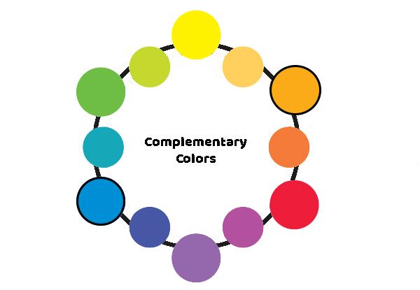
1. Complementary/Contrasting colors
Two opposite colors on the color wheel are the complementary colors to each other. Using complementary colors can captivate more attention. The tints, tones or shades (hyperlink to know the difference) of different amounts of complementary colors can be used to achieve contrast. Higher contrast is preferred over low, as it can easily be distinguished.
Blue and orange are complementary colors. When used together, the darker dominance of blue over the bright orange, becomes appealing.
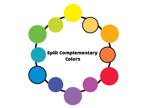
2. Split complementary colors
It is a combination of three colors. Choose a color, find its complementary color but instead of using this complementary color, use the two colors on its either side. For instance, blue with yellow orange and red orange but not orange. This color scheme is dramatic and strong but doesn’t strain the eyes. It is a recommended choice for beginners by the experts.
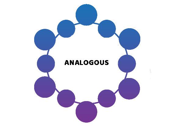
3. Analogous colors
Analogous colors mean the colors of the same family. These are the colors next to each other on the color wheel. This color combination is soothing as there are no drastic changes felt in the color difference.
Blue, blue green and blue violet belong to the same family. Use of such color scheme is harmonious and often seen in nature.
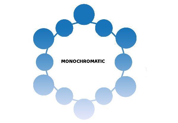
4. Monochromatic
As the name suggests, it is the use of only one color and all its tints, shades and tones. Employing monochrome is more difficult than it sounds. It is more subtle than the analogous colors. It can be used with a complementary color to create contrast and make the content rich.
The pure color blue and when it is mixed with white, gray and black, makes the blue monochrome. It is a delicate transformation from dark to light of the same color.
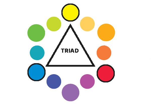
5. Triads
The colors that are located at equal distance from each other and forms a triangle on the color wheel, makes a triad. This scheme is vibrant and eye catching.
For instance, blue green, yellow orange and red violet. It is difficult to use this scheme, so the experts recommend to use one of these colors as dominant and other two as auxiliary.
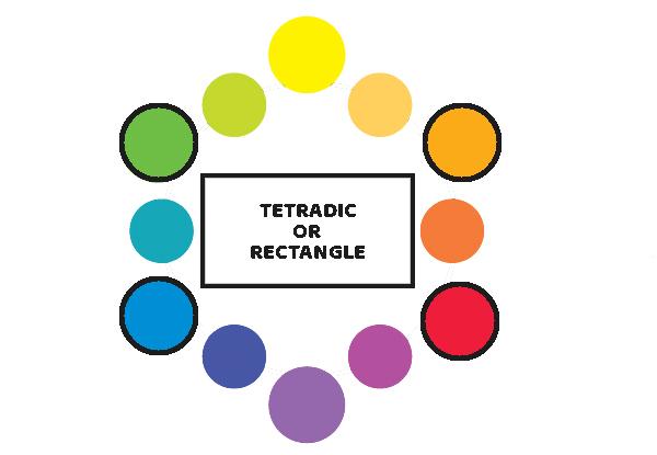
6. A tetradic
The colors that make a rectangle on the color wheel makes a tetradic. These four colors have two pairs of complementary colors. This gives an opportunity to form many combinations.
Blue, green, orange and red make a tetradic. It is also necessary to balance the warm and cool colors here.
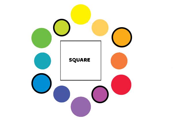
7. A square
On a color wheels, the four colors at equal distance, forming a square, makes a square color scheme. It is very similar to the rectangle color combinations.
For example, blue, yellow green, red violet and orange make a square. This scheme works best if one color is leading the other three.

Share your favorite color duets or triplets or quadruplets in the comments below!
Recently Published
loves or pursues or

.jpg)







.jpg)